MINA
Mobile Interface for Nutrition Awareness
There are plenty of nutritional applications in the app stores out there. Yet, there are numerous of reasons why users discontinue the usage of such — unsatisfactory usability or lack of traceability, for example. The goal of this project was to develop an interface that comprehensibly evaluates the healthiness of a meal with a human-centered approach.
Role
UX & Visual Designer, Developer
Timespan
April - October 2021
Context
Media informatics bachelor thesis
Keywords
Design research, Workshops, Prototyping, Frontend development, User tests, Evaluation
The motivation
More and more people from all over the world are suffering from obesity, which is associated with
a low level of the ability to find and understand basic information about nutrition, called Nutrition
Literacy. Mobile health applications can already effectively convey information about nutrition and
influence the diets of users positively. However, numerous barriers exist that reduce the likelihood of
long-term use and effectiveness of nutrition apps. In addition to the degree of usability, these include
the trustworthiness of the information presented.
To overcome these barriers and fully exploit the proven potential of nutrition apps, I elaborated a prototype of such an interface using the human-centered design process.
In 2016, more than 1.9 billion adults, 18 years and older, were overweight.
Of these over 650 million were obese.
The challenges
Challenge #1
Information overload
Handling the amount and complexity of nutritional data but avoiding information overload at the same time.
Challenge #2
Avoiding the black box
Creating and maintaining the comprehensability and explainability of the system's information and processes.
Challenge #3
Nutrition literacy
Facilitating the user's nutrition literacy and overall understanding of healthy nutrition by the usage of the interface.
The human-centered design process
In this project, I used the human-centered design approach according to DIN EN ISO 9241-210. It helped me keeping a clear focus on the user's needs throughout the whole development process.
Understand & specify context of use
Dive into the context. Before I could outline concrete design solutions, the application context had to be analyzed and understood. To learn more about the context of nutrition apps, their target audience, and initial usage requirements, I performed the following steps.
Review of existing nutrition apps
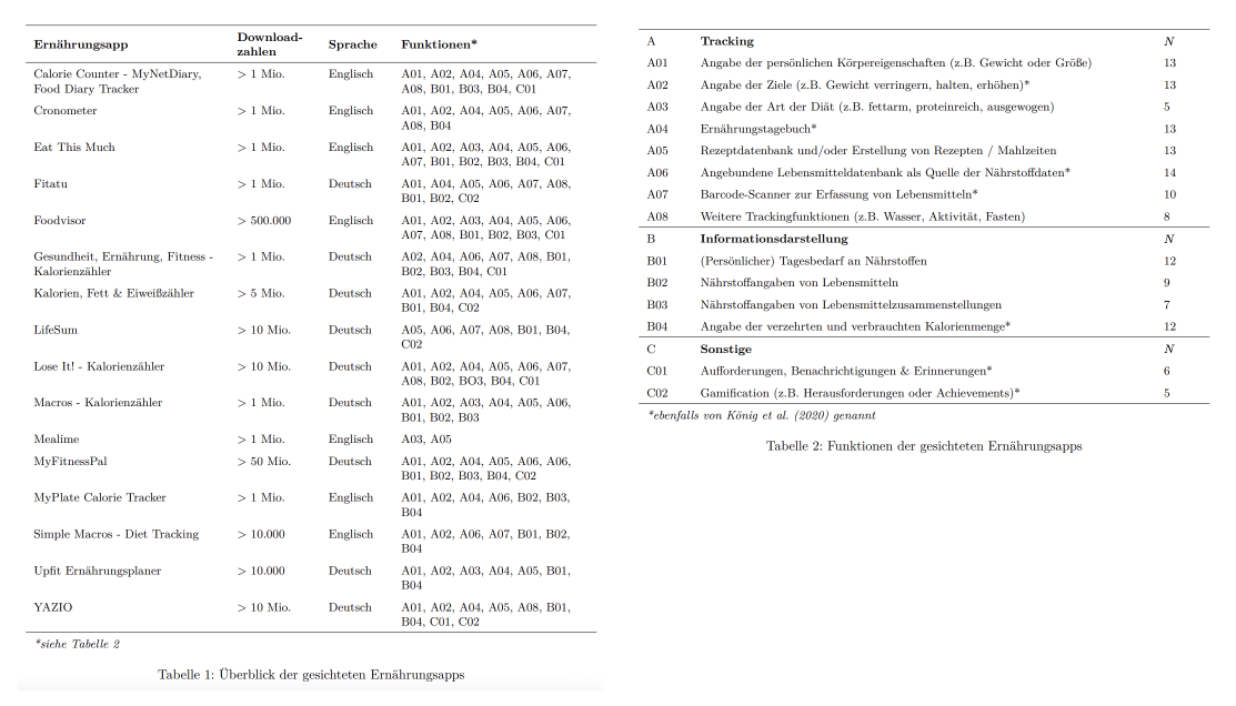
In order to get a better understanding of state-of-the-art of the context of use, I conducted a review of 16 nutrition apps. By that I was able to find out about the most popular features.
Workshop with potential users
Through a Design Studio Workshop with 21 participants, I got a lot of insight on the expectations and needs of potential users.
Scanning literature regarding m-Health
Scientific literature on m-Health apps was helpful to find out about common reasons why users dropped out and long-term use failed to establish, for example.
Review of existing systems
To get a better understanding of the state-of-the-art of nutrition apps, I did a short review of 16 apps in the Google PlayStore. I listed their download counts, language and main features. By that I was able to find out the 14 most popular features and categorize them into (1) Tracking, (2) Information Visualization and (3) Others.
The review gave me a first overview about possibly fitting features for the project, but I was aware that these findings are most certainly not absolute and have to be looked at critically.
Workshop with potential users
In order to get more insights on the user's expectations, I invited 21 potential users to a creative workshop to discuss the following question:
How would a solution have to be designed so that the evaluation of a meal is presented in a comprehensible way?
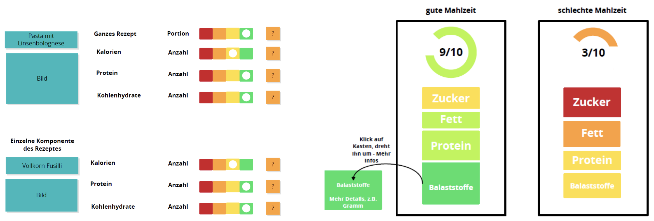
Most of the participants designs suggested meals into their nutrients, then rating each nutrient and placing them in a color coded 4-level scale. This reminded me of the popular NutriScore very much. The NutriScore is printed on the packaging of some food products in Germany, giving an indication on the healthiness of the product.
Takeaways
- Color coded rating can give a quick insight
- Rating on different levels of detail (e.g., overall healthiness and rating of individual nutrients)
- Give context of the rating. For example, which amount of fat would've been categorized as healthy?
User requirements
From the context analysis I then have derived the systems requirements.
- List ingredients of the meal
- Display the amount of the individual nutrients
- Show healthiness score for the meal
- Get insights on the calculation of the score
- View and understand the influence of ingredients on the score
- Display and understand the influence of a nutrient on the score
- Display and understand opportunities for improvement of the meal
Development
Wireframing & design iterations
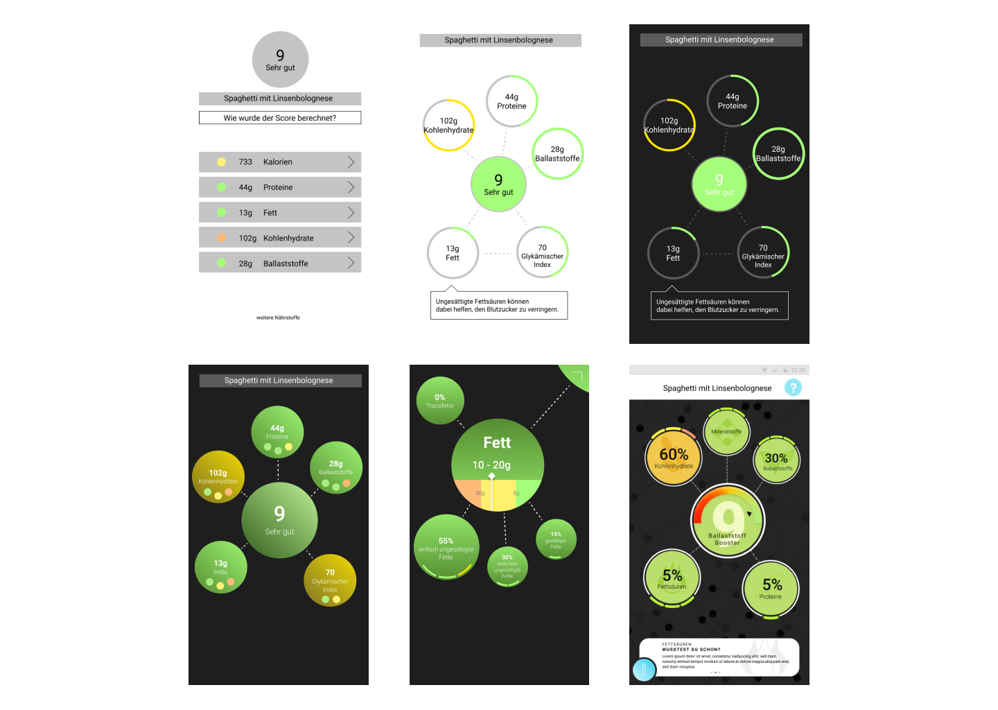
One of the main challenges in designing the interface was the amount of relevant data in the nutritional context, since there are many different types of nutrients in a meal. To handle this challenge, I looked at scientific literature and their approach on avoiding information overload in information visualization. For example, Ben Shneiderman's approach of Overview first, zoom and filter, then details-on-demand introduces the concept of giving a general information overview and then allowing the user's to access more details on preferred information.
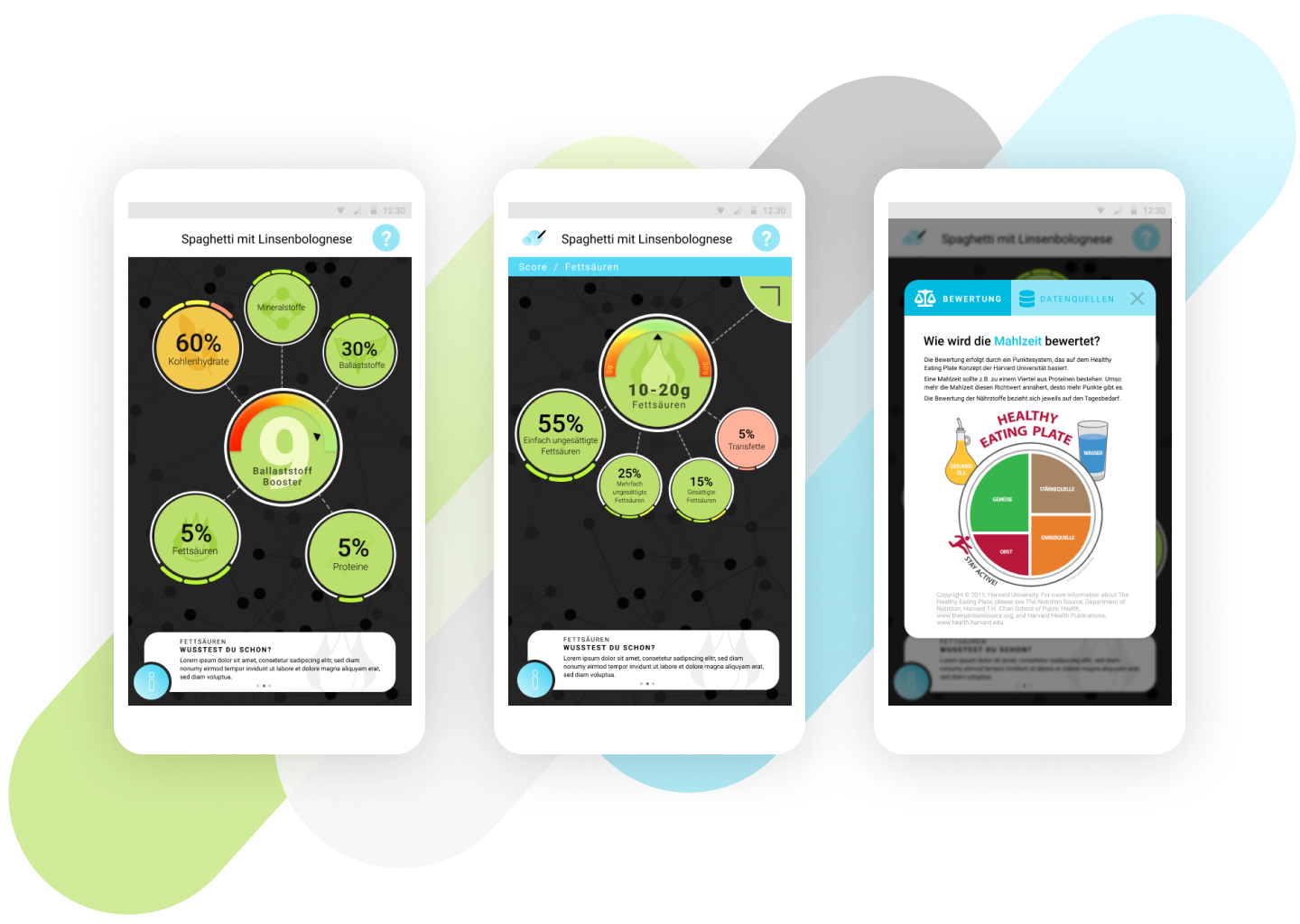
Final prototype in Figma
To address the three challenges proposed at the beginning, I came up with the following four main components / structures that are based on the analyzed user requirements.
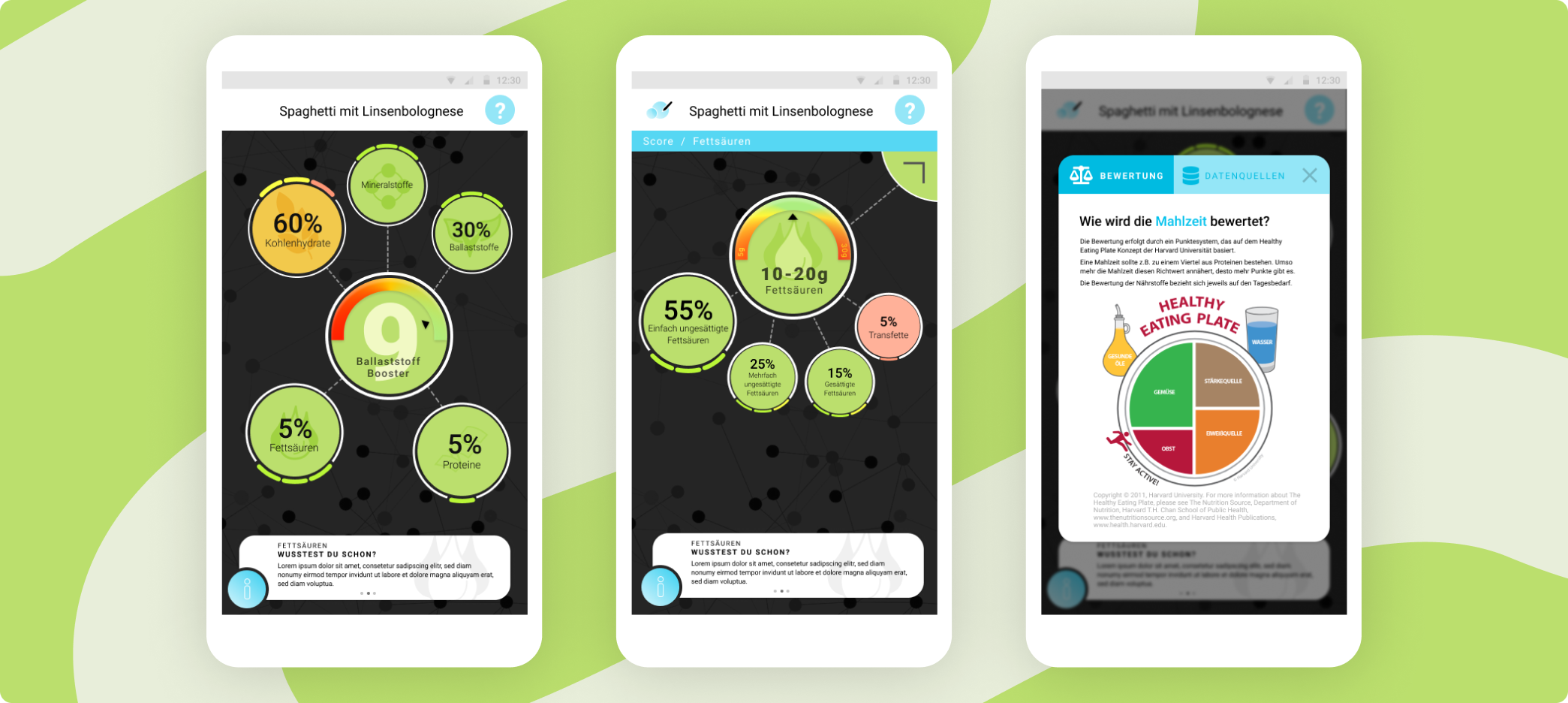
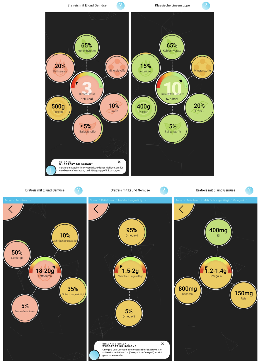
Different layers of information detail. In order to be able to handle the amount of information and to prevent information overload for the users, I have integrated different information levels. Users face a overview of the main score and nutrients at the start screen and can then navigate into deeper levels of the nutrients to get more detailed information.
Context of the score rating by providing scales that indicate the amount of a nutrient that would be considered as being healthy. This allows the users to facilitate their own nutrition literacy by being able to understand why exactly their meal isn't healthy and how to adapt it to leverage the healthiness score.
Insights on the calculation of the score were given, so that trust in the system, understanding of its processes and what meals are seen as healthy could be formed. For that, users received sources and an introduction of the underlaying rating method.
Tips. To further allow the facilitation of nutrition literacy, the system recommends steps to improve the meals healthiness that weren't necessarily perceivable from just the interaction.
Web prototype
Besides designing the interface, I also implemented it as a web-based prototype. For the information visualization I used the Javascript framework D3.js, through which the bubble structure can be generated dynamically based on a JSON dataset.
User testing & evaluation
For my evaluation I got 15 participants that carried out different tasks in a randomized order. They not only interacted with the developed MINA interface, but also with an existing nutrition app, which used tabular visualization for the information display. Through that I was able to distinguish whether the design solution was any better in terms of comprehensibility and understanding of healthy nutrition.
Results
The results of the evaluation indicate that both confidence in the system, correct task completion, and subjectively perceived facilitation of nutrition literacy in the designed MINA nutrition app achieved higher scores and significant differences compared to the comparison system.
Qualitative data like the following comment indicate that the basic structure of the design is working, but there is still some room for improvements on the usability and comprehensibility part:
I can definitely see that the whole dish is not that great and that three [nutrients] are red - that's probably problematic.
With the colors, you can't see through what the green now means [and] what this refers to.

Conclusion
The concept of the MINA interface works fundamentally. By dividing the information into different levels, the amount of information could be conveyed in a more structured and understandable way. The color coding also proved to be easy to understand.
Nevertheless, the evaluation showed that there is still room for improvement in terms of usability and comprehensibility of the calculation of the score.
These findings can now be addressed and re-evaluated in further iterations.
Key learnings
Learning #1
Review test results critically
Analyse the qualitative results of the user tests on a meta level and try to draw more conclusions about the basic needs of the users.
Learning #2
Don't underestimate the HCD process
The human-centred design process is a complex and elaborate procedure. This has its good reasons, of course, and should therefore be planned through realistically and generously from the beginning.
Learning #3
Don't. Get. Frustrated.
It's mostly impossible to get the perfect design in the first iteration. Don't get frustrated but analyze your mistakes and go on.