MariData
Comprehensive Technologies for Ship Energy Management

In the MariData project, a future-oriented energy management and decision support system based on rational methods is to be developed, taking into account current operational status data as well as geoinformation.
Role
UX & UI Design, Design Research
Timespan
December 2020 - March 2023
Context
Funded Research Project
Keywords
Workshops, Prototyping, Design Documentation
Problems & Challenges
Challenge #1
How can we design a maritime navigational system that supports in operating ships in a more energy-effient way?
Shipping is a complex context that brings with it legal regulations and standards that need to be taken into account when designing and implementing.
Challenge #2
How can we support the successful adoption of the system in the operational routines by design?
The provision of new expert systems and the associated change in work routines can create barriers to their adoption.
Challenge #3
How can we set up the design infrastructure to ensure consistency across all project partners and states?
Due to the high number of project partners and the fluctuation of employees (as many student employees are involved), a project structure must be defined at the beginning that brings long-term consistency.
About the MariData Project
Whereas in the past it was mainly economic reasons that motivated the search for a low power requirement for a ship, today ecological reasons and compliance with legal regulations to reduce emissions are at least equally important. These call for a consistent strategy of energy efficiency and a significant reduction in exhaust emissions not only during construction but also during the operation of ships.
3%
of the world's carbon output was attributed to shipping in 2018
70%
of ship operating costs are due to energy costs
MariData is a joint project of 11 project partners from business and research with the aim to develop a forward-looking energy management and decision support system based on rational methods. The University of Lübeck was responsible for the psychological concept, the interface design and its testing within studies.
Interested in more details? Take a look at the paper by Zoubir et al. about energy efficiency operations on ships and marine vessels.
Requirements
As the context of shipping and the associated work routines were largely unknown to me and other designers, we decided to formulate the requirements based on User Stories defined by experts.
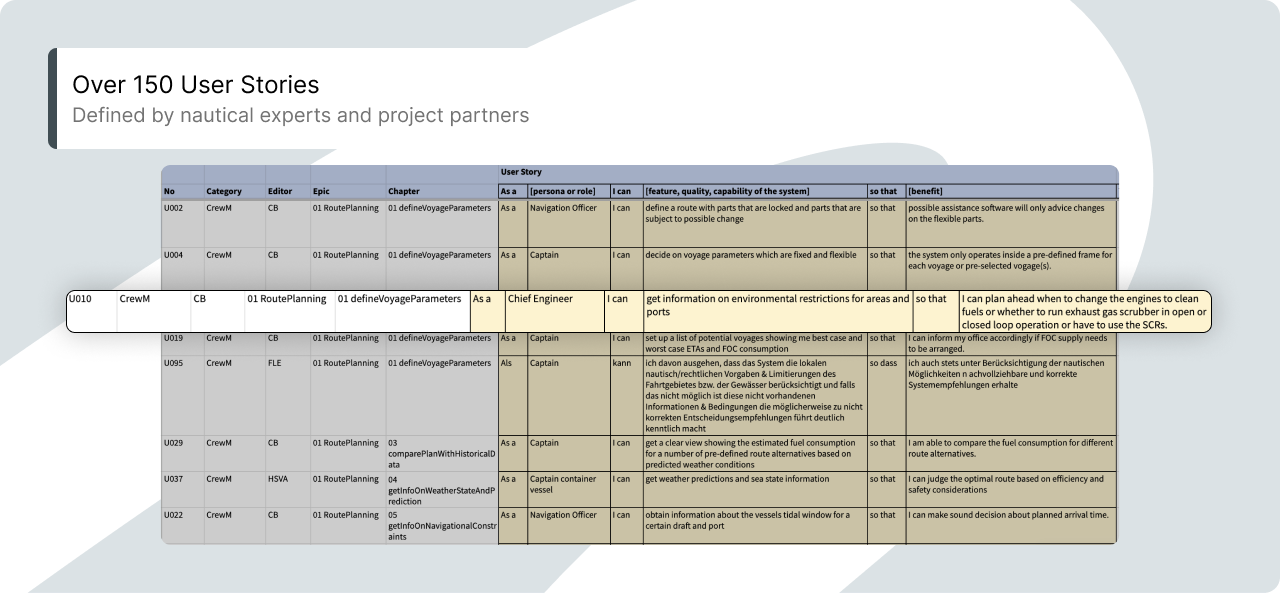
These mainly comprised user stories from the following categories:
- Types of Data (e.g., ETA, Under Keel Clearance, Fuel Oil Consumption)
- Subsystems (e.g., Route Planning, Route Monitoring, Machine Control, DSS Interface)
- Routines (e.g., obtain information about the vessels tidal window for a certain draft and port)
Together with maritime guidelines, we transferred these user stories into a draft of the system structure.
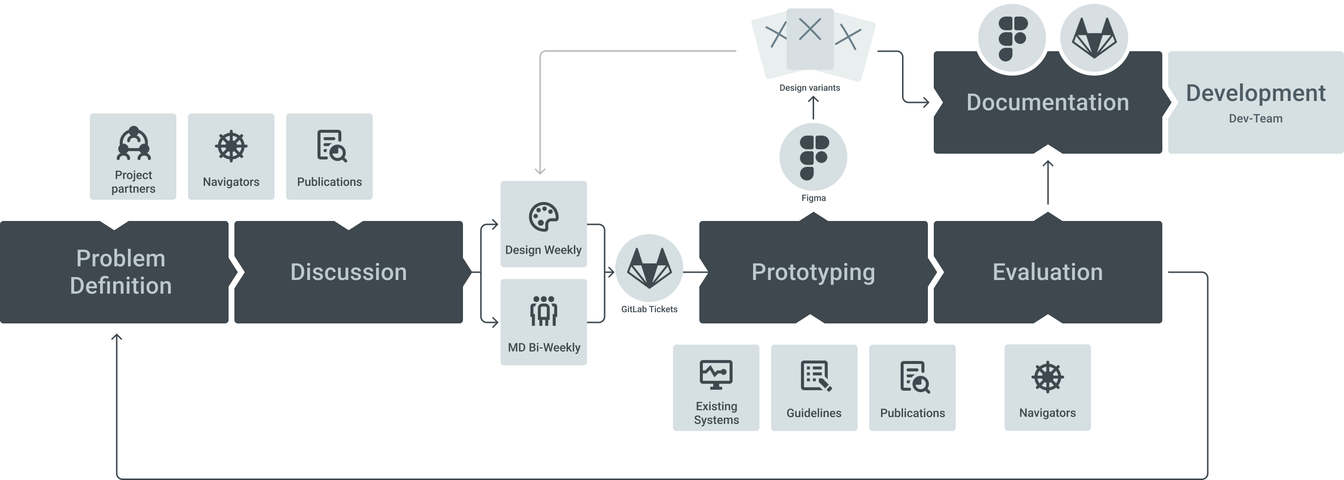
The Design Process
Since the context of shipping is uncharted waters for most team members, we rely on knowledge from not only literature and maritime guidelines, but also navigators with whom we are in close exchange and who are consulted for e.g. formative design evaluations.
Example: Visualizing Effects of changes in Speed
The choice of speed is essential for both, ETA and emission output. The planning and monitoring of ship speed is therefore often mentioned in the user stories. Here are two examples:
User Story · Route Planning
As a Navigation Officer I can simulate different speeds and ETAs at the English Channel entrance waypoint or other high tidal current areas to get a fuel saving prediction for different ETAs and transit speeds so that I can plan the voyage to maximize positive tidal / current influence.
User Story · Route Monitoring
As a Captain I can choose the speed and trim for the stretch ahead based on the DSS prognosis so that I meet the ETA with a minimum fuel consumption by not only reducing the speed.
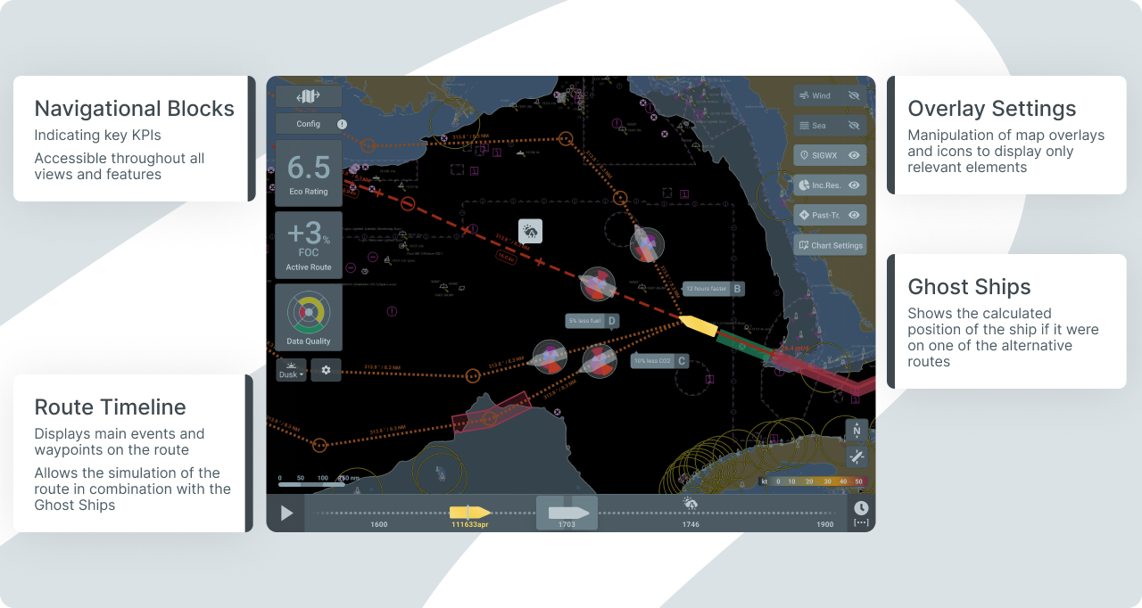
This led to the assumption that the MariData interface should provide a visualisation of the influence that speed has on the route.
Problem statement: How can we visualise the effects of a speed change for seafarers during route monitoring?
The first approaches to this problem were drafted during a Design Studio Workshop with various MariData colleagues from different disciplines. Afterwards, I discussed these sketches with an expert from the maritime industry to define relevant use cases and data for this type of visualization.

The feature makes it possible to divide the route into definable sections, which are then evaluated and colour-coded based on the predicted energy efficiency.
Example: Color Palette
The choice of color palette is crucial for user experience and aesthetics because it directly impacts how users perceive and interact with the interface. It can, if poorly chosen, overwhelm users, reduce accessibility, and create a disjointed or frustrating interface. Especially in a complex environment such as a ship's bridge, where lighting conditions are constantly changing, a functional choice of colour is essential.

In order to build on the system that the ship's crew is already familiar with, we have based our choice of colours on the standards of the International Hydrographic Organization. These offer different colour palettes for day, dusk and night. For the prototype and proof of concept, we used the dusk palette as this is the best compromise for day and night use. In order to achieve better colour contrasts and thus better readability of texts, for example, we added additional white and grey shades.
Excursus: Self-Determination Theory
The Self-Determination Theory (SDT) suggests that people are motivated to grow and achieve their full potential when their basic psychological needs are satisfied. These needs are categorized into three main components:
Autonomy
The need to feel in control of one’s actions and decisions
Competence
The need to feel capable and effective in interacting with the environment and mastering challenges
Relatedness
The need to feel connected to others, to belong to a group, and to have meaningful social relationships
When these psychological needs are met, users are more likely to internalize the benefits of the system, see its value, and make it a regular part of their routines.
System Features and Structure
As the nautical chart is a central element of navigation tools, the aim was to place as much information as possible around it. We therefore had to differentiate which KPIs were worth integrating on the map view and which would only be visible in further detailed views. This led us to introduce a system of three levels of information, in which the information can be found according to importance and level of detail.

The Design System: Anchor of the Interface
Since multiple designers and developers are participating in the MariData project, we designed and implemented a design system to ensure consistency and efficiency across the entire product. The design system helps to establish common design principles, components and standards that are used by all team members.
~30
Atoms
~50
Organisms
~25
Templates
On the design side, we built a component library in Figma based on the atomic design framework . We decided to build the design system from scratch, as we believed it is the best way to integrate maritime interface standards into the design and popular design systems, such as Material Design, are not suitable for the context. However, during a later stage of the project, the OpenBridge project was launched, so we migrated on their Icons.

The design system allowed us to ensure that all design elements look and feel the same, regardless of in which feature or view they are used. It also facilitated collaboration between designers and developers, as both sides could access the same reusable components and guidelines. This not only sped up the development process, but also minimised errors and reduces the effort required for subsequent adjustments and maintenance.
Learnings
As I was a part from the beginning of the project, I learnt a lot about initiating a project, such as building a design infrastructure and planning a design system from scratch.Focus on what really matters – don't reinvent the wheel!
The focus of the MariData project was the development of a decision support system to promote energy efficiency in shipping. In order to achieve results quickly and be able to iterate, it makes sense to draw on and utilise existing resources. Nevertheless, we had to go the extra mile and build our own design system that meets the requirements of the industry and can be used on a tablet. We later came across the OpenBridge project, which offers a design standard for maritime interfaces. At this point, MariData was already too far advanced to adapt all the elements to this. Nevertheless, we decided to adopt their icons instead of developing our own icons - as this is time-consuming and does not directly contribute to the project goal.
Finding the right documentation strategy is essential
Throughout the project we had to adjust the way we documented and handover the design several times as we have certainly learned a lot about design documentation. As some student assistants were working on the project, there was a high turnover and new ones had to be regularly onboarded. A standardised method of documentation from the very beginning would certainly have helped with comprehensibility there.